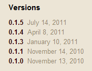
When choosing to use an open source project you might want to know whether it’s still developed or at least maintained. For Ruby projects I used to check Rubygems release dates. Here’s Grape’s.

Nothing for the last six months? Not very good – there hasn’t been a release for a while, but that’s more a tribute to the stability of the project.
You could check the number of forks and watchers for projects on Github.

It measures the project’s popularity quite well, but maybe not its activity.
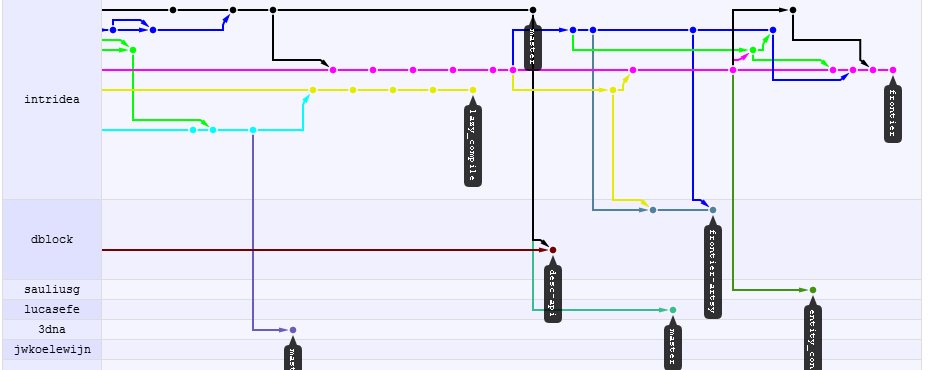
My favorite way of measuring a project’s activity is to look at the Github network graph. It’s an amazing and useful feature. Here’s Grape’s.

The project is clearly happening. But you can see how this is all over the place – that’s a typical picture for open-source efforts: few core and relatively irregular contributors, long branches and abandoned ends for feature attempts that don’t get merged.
When a small group of people truly collaborates, their feature branches make it into master most of the time. They are also constantly picking up commits from the source. What does a really dense collaborative project look like? Here’s a picture from one of our private repositories. If yours looks like this, you got a team!

Maybe someone can use this idea to build a nice feature to measure a Github project density?

